The Challenge
Trucks for Pups needed a brand identity that felt both playful and professional, something that could capture the heart behind the mission while still building trust and recognition. The challenge was creating a visual direction that reflected compassion, movement, and community impact without feeling too childish or unclear.
The Approach
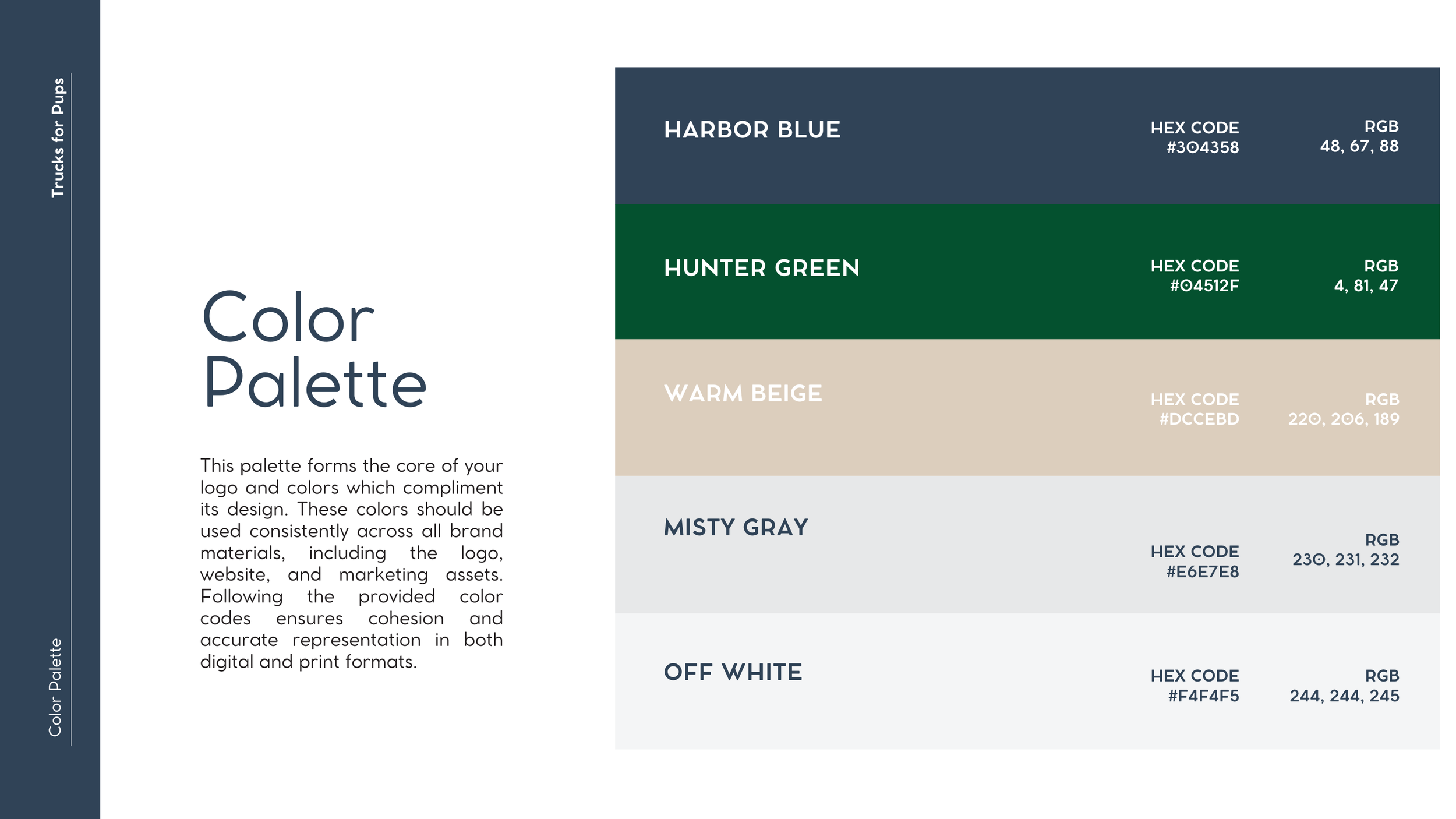
The approach focused on developing a thoughtful logo system rooted in warmth, clarity, and purpose. Through intentional font selection, color palette development, logo refinement, and overall visual consistency, the logo was shaped to feel approachable, memorable, and aligned with the organization’s mission.
The Solution
The result was a cohesive logo and design direction that gives Trucks for Pups a stronger, more polished identity. The final logo system balances friendliness with credibility, helping the organization communicate its mission clearly while creating a look that can grow across web, print, and promotional materials.